

How to Design Branded Van Graphics That People Can Read in Seconds
Share
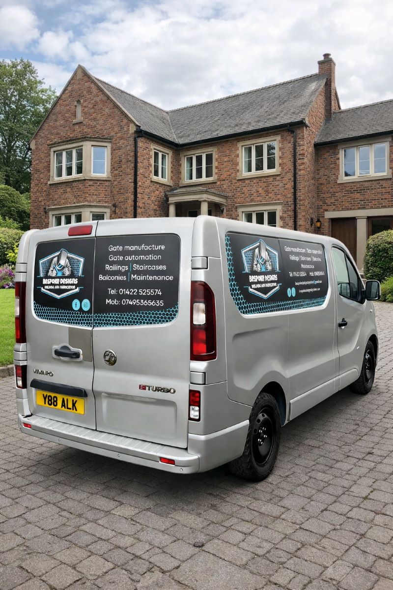
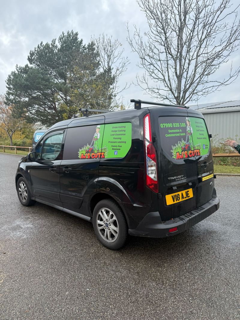
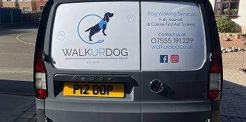
Branded van graphics are one of the most effective ways to advertise your business while you’re out on the road. The challenge is that most people only see your vehicle for a few seconds as you drive past or when it’s parked nearby. That means your design needs to be clear, simple, and easy to understand at a glance.
If your graphics are too busy or difficult to read, potential customers may miss your message completely. The good news is that a few simple design choices can make a huge difference.
Keep the Message Simple
One of the biggest mistakes businesses make is trying to include too much information on their van graphics. Remember, people only have a moment to take in what they see.
Focus on the most important details:
- Your business name or logo
- A short description of what you do
- A phone number or website
Keeping the message short helps people quickly understand who you are and how to contact you.
Use Large, Clear Fonts
The font you choose plays a huge role in readability. Decorative or overly complicated fonts might look interesting, but they can be hard to read from a distance.
To keep your branded van graphics easy to read:
- Choose simple, bold fonts
- Avoid overly decorative lettering
- Make sure key text is large enough to read from several metres away
- Use different font sizes to highlight the most important information
Your business name and contact details should always stand out the most.
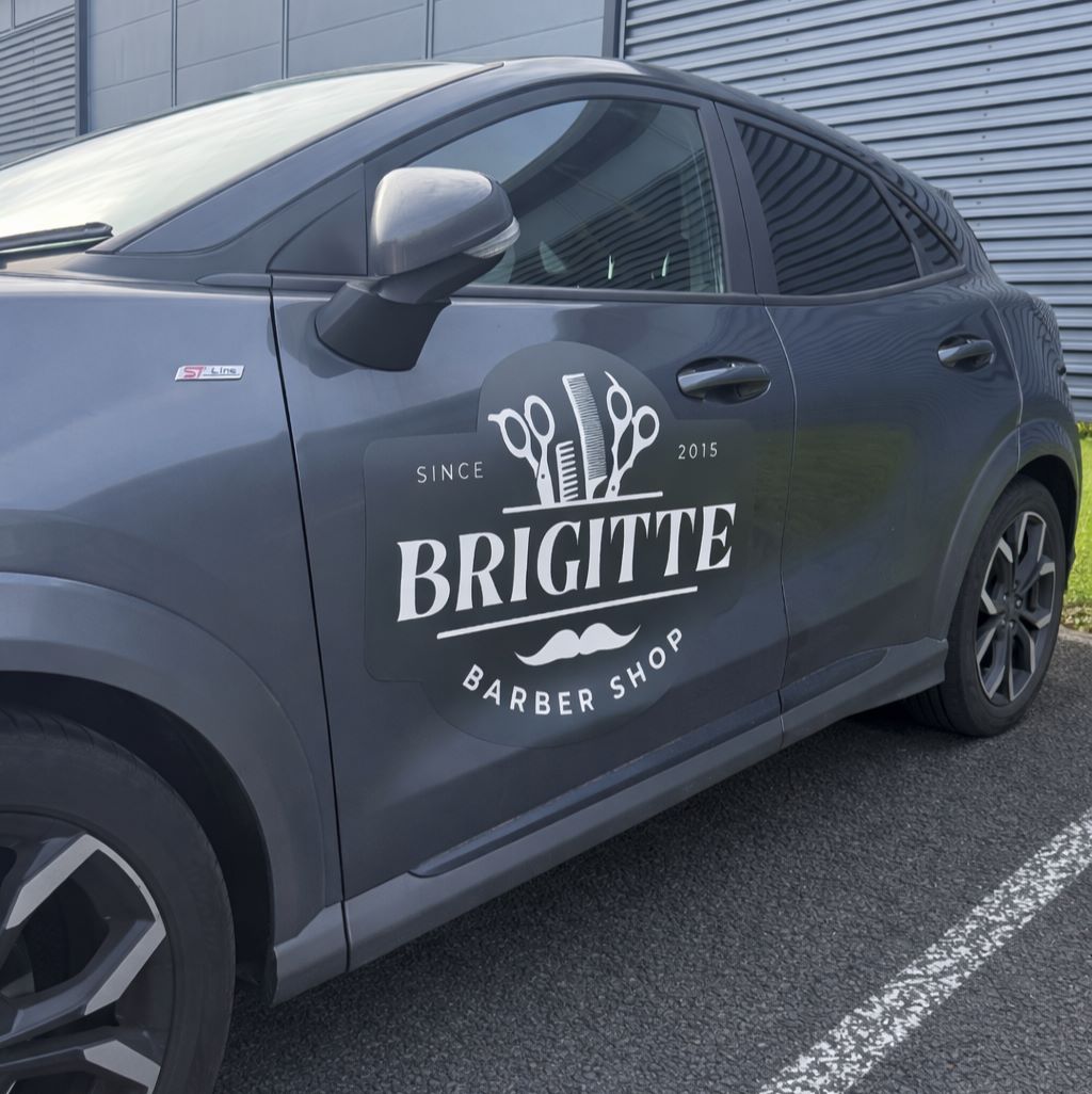
Choose High-Contrast Colours
Colour contrast is another important factor. If your text blends into the background, people won’t be able to read it quickly.
For better visibility:
- Use dark text on light backgrounds or light text on dark backgrounds
- Avoid colour combinations that are too similar
- Stick to two or three main colours to keep the design clean
Strong contrast helps your graphics stand out even when your van is moving.
Think About Placement
Where your graphics are positioned on the van can affect how easily they’re seen.
Some good placement tips include:
- Put your business name on the side panels, where it’s most visible
- Place contact details on the rear doors so drivers behind you can see them
- Avoid placing important text over door handles, trims, or panel gaps
Good placement ensures your message stays clear from different viewing angles.
Make Your Van Memorable
Clear and simple graphics are often the most effective. When someone sees your van for just a few seconds, they should instantly understand what your business does and how to reach you.
By keeping the design simple, using readable fonts, choosing strong colours, and placing your graphics carefully, your van can become a powerful moving advert that people remember long after they’ve seen it.